Olivers Horticulture
From roots to new heights - transforming Olivers' legacy business for the future.
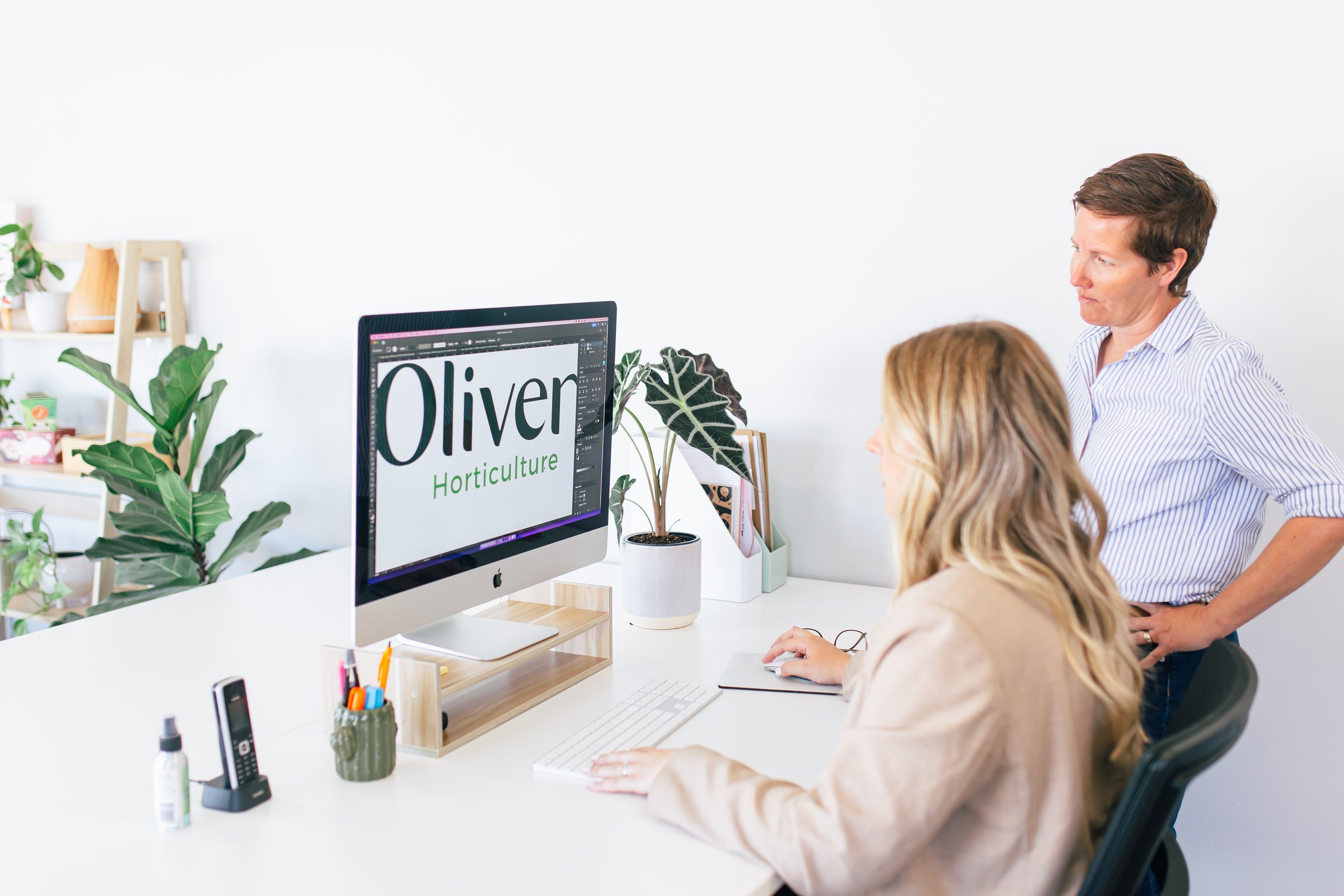
A family business started in the 1980s, Olivers approached us wanting to develop a visual identity that reflected the next generation and trajectory of the business.
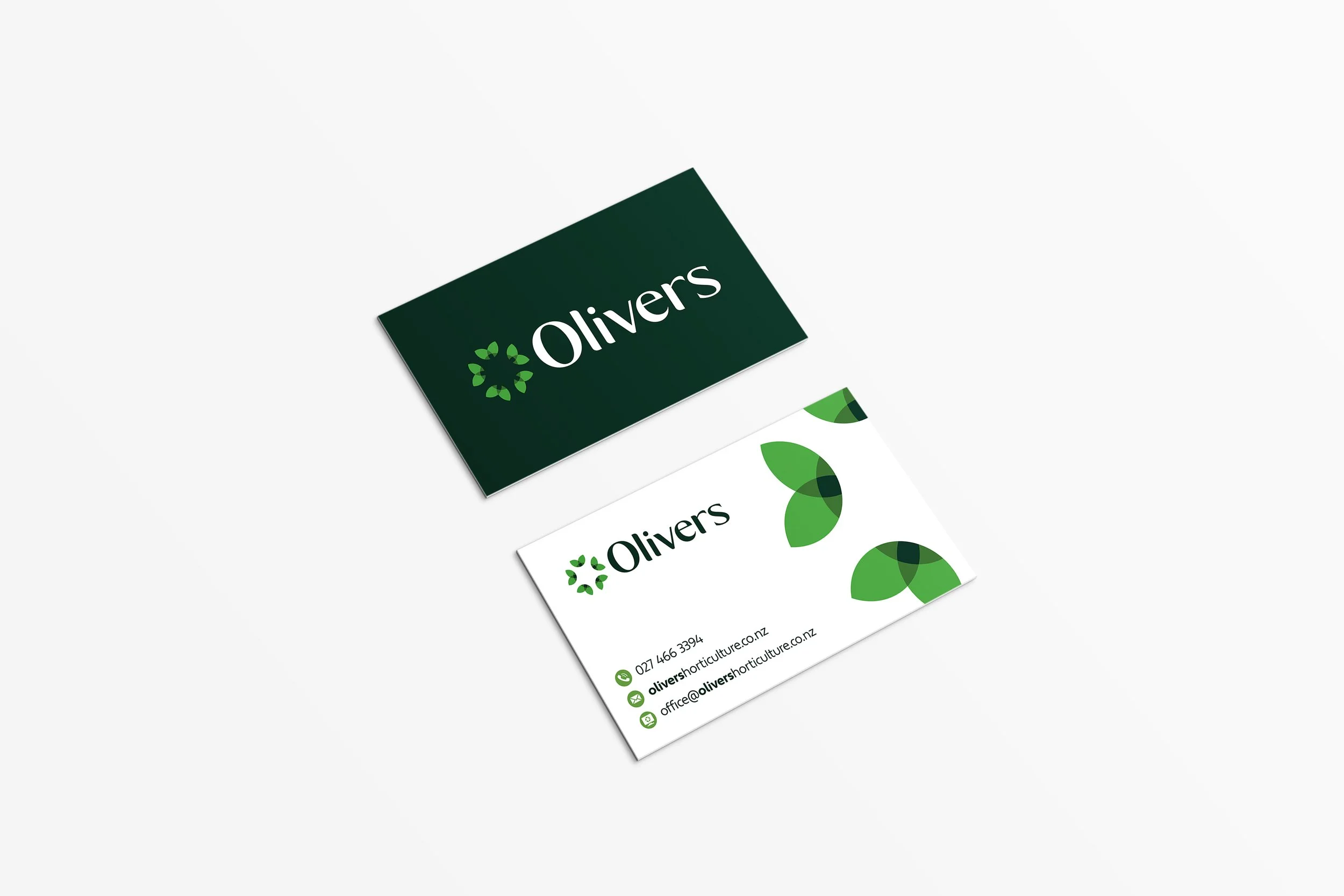
Our design team worked closely with Olivers to create a circular logo that represented the coming together of family over generations to build a lasting legacy. The circular shape also symbolised the wealth of knowledge the family has in growing and managing orchards. The modern, sophisticated typography reflects the heritage element of the brand with a modern twist.

Olivers' unique selling points are that they have a hands-on, personal approach and prioritise quality and care over scaling. We knew that their branding had to reflect that.
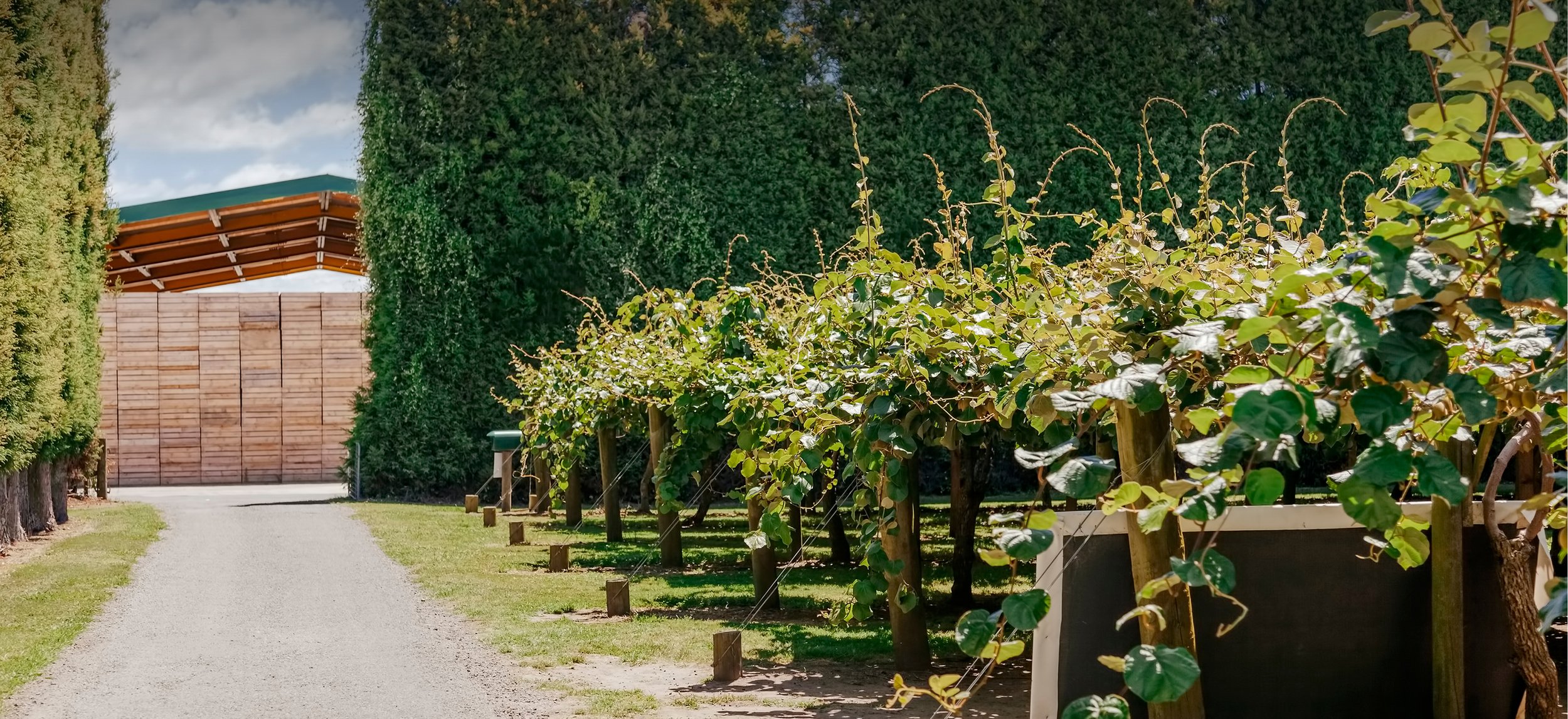
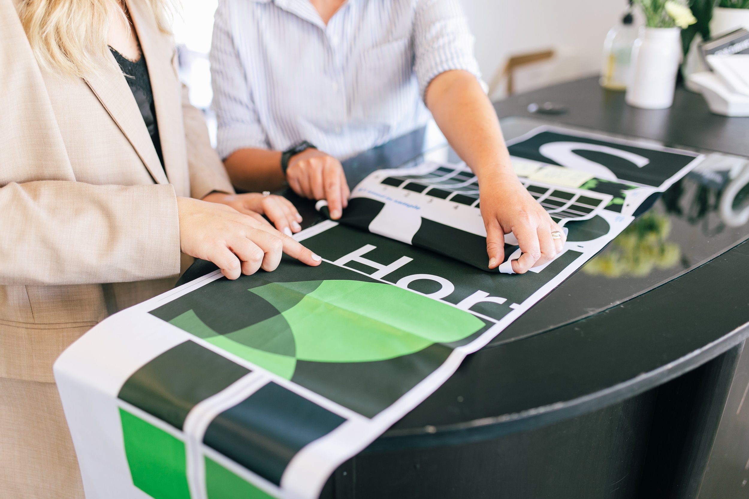
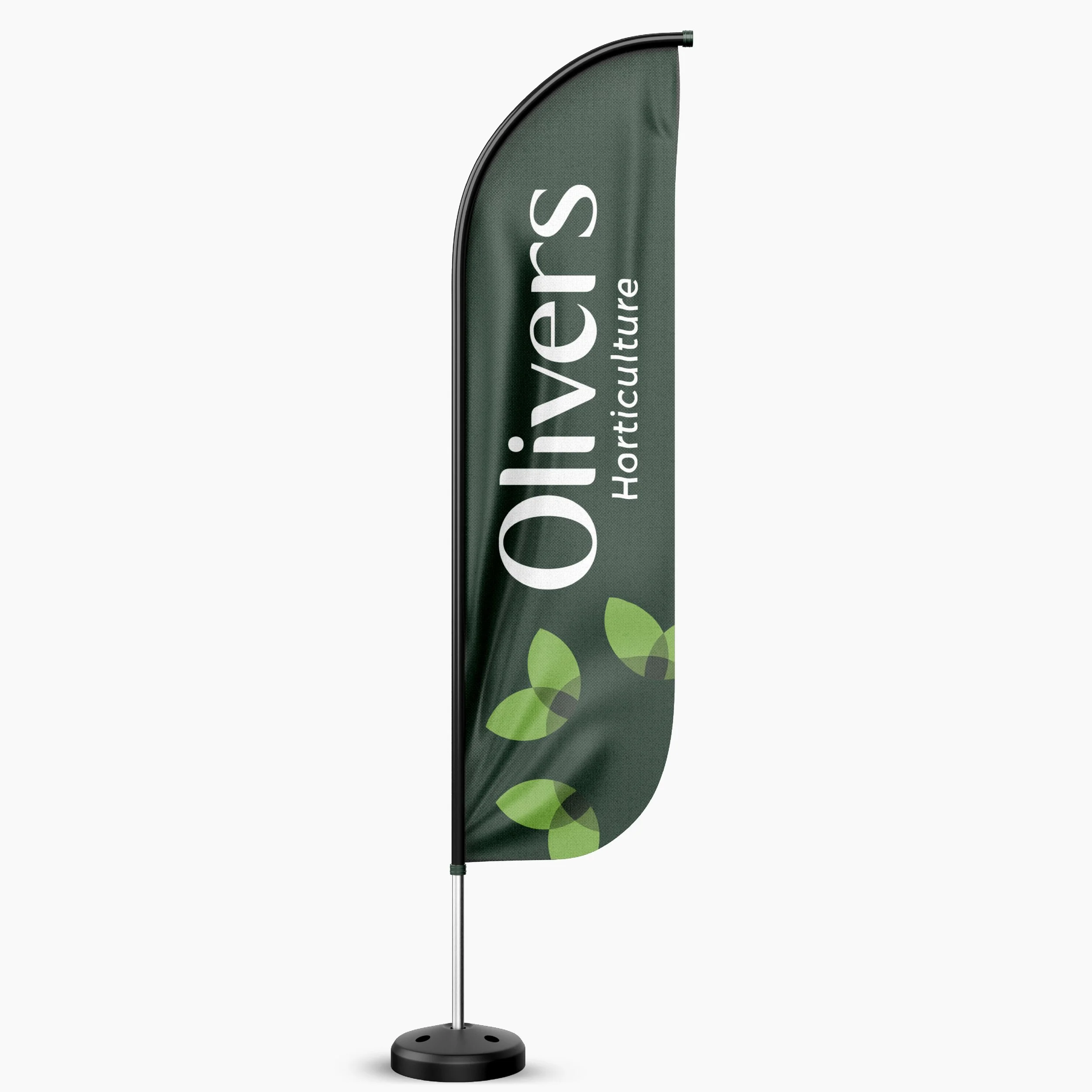
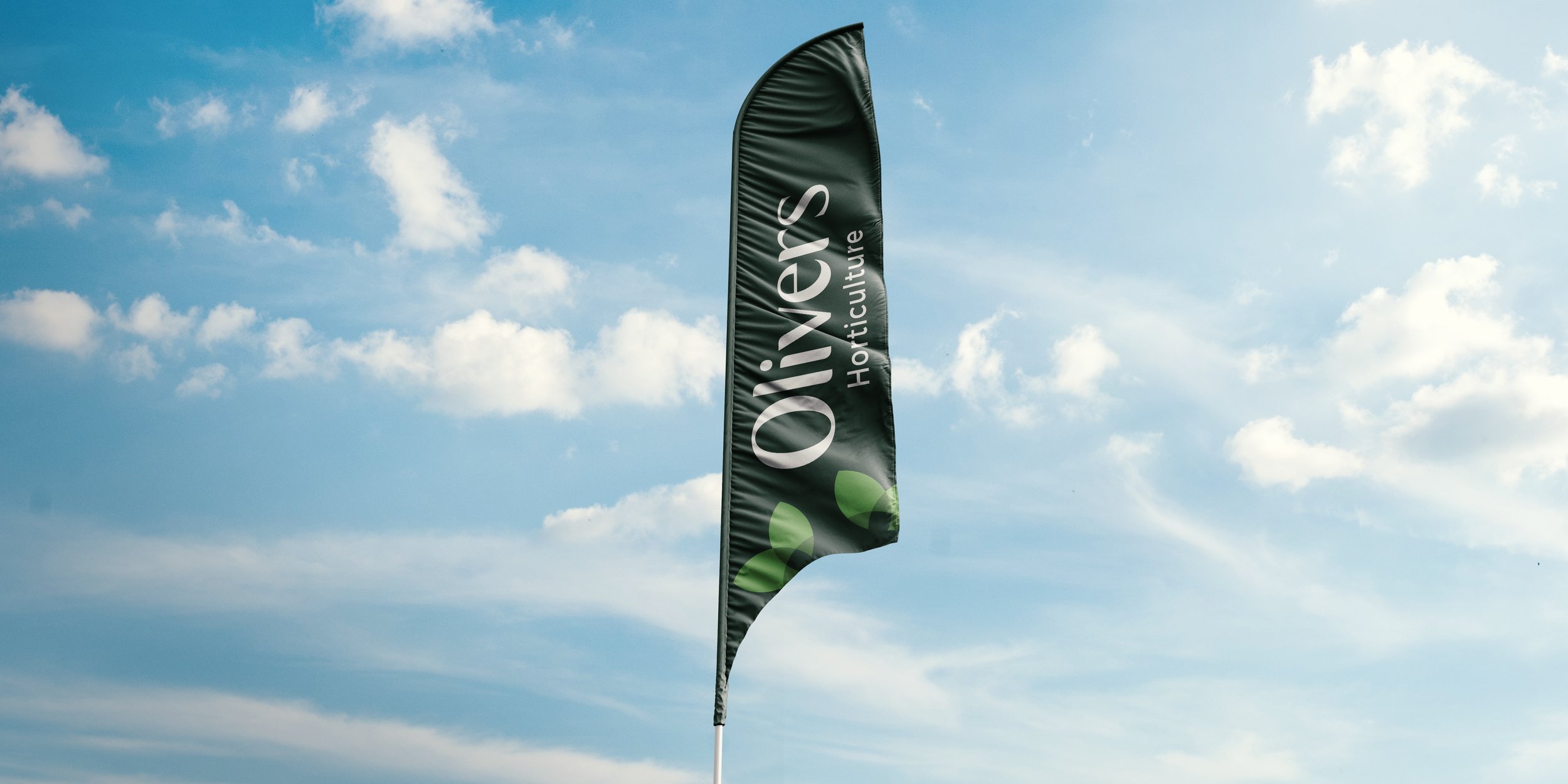
We developed a range of collateral that showcased their orchard management of kiwifruit, kiwiberry, avocado, and more. Eye-catching market flags and striking orchard gate signs were designed to make a big impact and draw attention to the new brand and build brand awareness.
In addition to physical collateral, we also developed digital ads to attract new talent, as well as sleek email signatures that added a professional touch to their communication with clients and partners.
The overall look and feel of Olivers' new branding is crisp, professional, and reflective of the pride they take in their work. The brand collateral we created has helped elevate their legacy family business to a new level and has set them apart from their competitors.
Working with Olivers was a joy, and we are proud to have been able to help them showcase their passion and expertise through their branding. We are confident that the new visual identity we created will help Olivers continue to thrive for generations to come.

Let's bring your vision to life - it all starts with an idea.
Book a complimentary discovery meeting with the team today or phone us on 07 281 1715.
Curious to see more?